Mobile Website Design Services
Mobile-first websites designed for the way people actually browse: fast, intuitive, and optimized for every screen size.
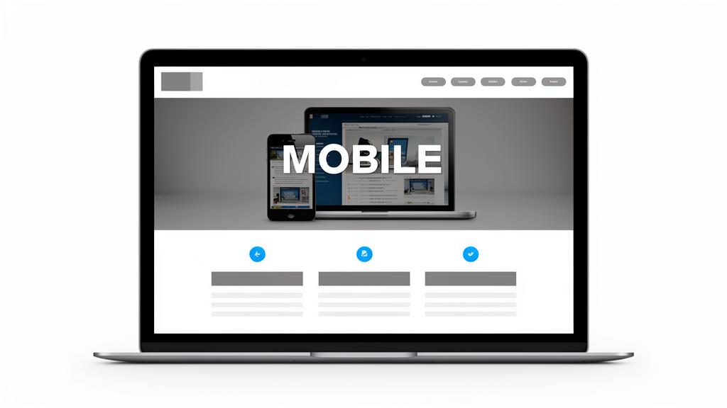
Get a Free QuoteA Website Built for the Mobile World
Over 60% of web traffic comes from mobile devices, yet most websites are still designed desktop-first and merely shrunk to fit smaller screens. The result? Tiny text, hard-to-tap buttons, slow load times, and frustrated users who bounce to your competitor.
I take a mobile-first approach, designing for smartphones first, then scaling up to tablets and desktops. This ensures your mobile experience isn't an afterthought but the foundation. Thumb-friendly navigation, lightning-fast load times, and conversion-optimized layouts for every screen.
What's Included
- Mobile-first design methodology
- Thumb-friendly navigation & interactions
- Touch-optimized buttons & forms
- Lightning-fast mobile load times
- Responsive across all screen sizes
- Click-to-call & click-to-map integration
- Mobile-optimized images & media
- Mobile SEO & Core Web Vitals
- Progressive Web App features (optional)
- Cross-device & cross-browser testing
Deliverables
Mobile-first website + Performance optimization + Mobile SEO + Cross-device testing + 30-day support
Why Mobile-First Matters
Thumb-Friendly Design
Navigation, buttons, and interactive elements sized and positioned for easy one-handed use on any smartphone.
Lightning-Fast Speed
Optimized images, minimal code, and efficient loading strategies that keep mobile load times under 2 seconds.
Touch-Optimized UX
Swipe gestures, touch targets, and mobile-native interactions that feel natural on touchscreen devices.
Readable Without Zooming
Typography, spacing, and layouts designed so content is perfectly readable without pinching or zooming.
Works on Slow Connections
Progressive loading, compressed assets, and offline capabilities for users on 3G, 4G, and spotty Wi-Fi.
Mobile SEO Advantage
Google uses mobile-first indexing, so your mobile experience directly determines your search rankings.
Mobile Features We Implement
Every mobile optimization that makes a difference.
Frequently Asked Questions
Is mobile-first different from responsive design?
Yes. Responsive design adapts a desktop layout to fit mobile. Mobile-first designs for mobile first, then enhances for larger screens, resulting in a significantly better mobile experience.
Will the website still look great on desktop?
Absolutely. Mobile-first doesn't mean mobile-only. The design scales beautifully to tablets, laptops, and desktops with layout enhancements for larger screens.
How does mobile design affect SEO?
Google uses mobile-first indexing, meaning your mobile site is what determines your rankings. A fast, well-structured mobile experience directly improves your search visibility.
Do I need a separate mobile website?
No. I build one responsive website that's optimized for all devices. No separate mobile site, no duplicate content, no maintenance headaches.
Ready for a website that works on every device?
Let's build a mobile-first website that reaches customers wherever they are.
Get a Free Quote